San Antonio ISD—Sidney Lanier High School
Architects: LPA
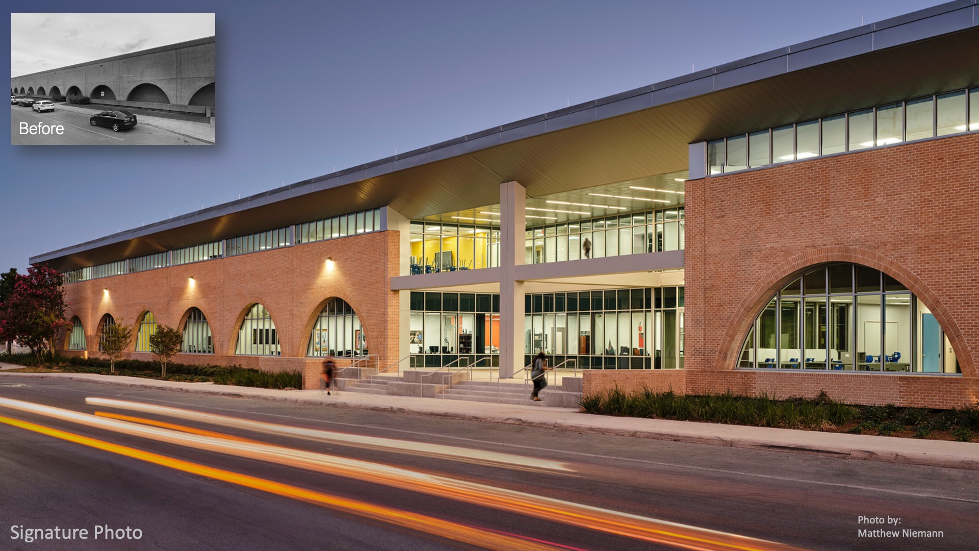
This high school renovation transforms a massive 1970’s windowless, brick building rife with security, daylight and infrastructural issues. The design focuses on the power of daylight, the wonder and delight of the local Mexican-American culture, high performance design and curriculum innovation through flexible space planning. The building is 200,000 sf, has the footprint of two football fields, is over 400′ long and is the heart of the campus. With each intervention, the existing building’s history and architecture are celebrated and given new life. In an area where 99% of it’s population is minority and 95% is economically disadvantaged, equity and representation of the community is crucial in this project. The community contributed without limitations to this renovation project. This allowed the project to suit the community’s educational goals and push the school’s program that had not been developed in years into the future. This project develop the first school of 99 in the district with flexible, next generation learning space types that aligned with this school’s educational goals.
 Design
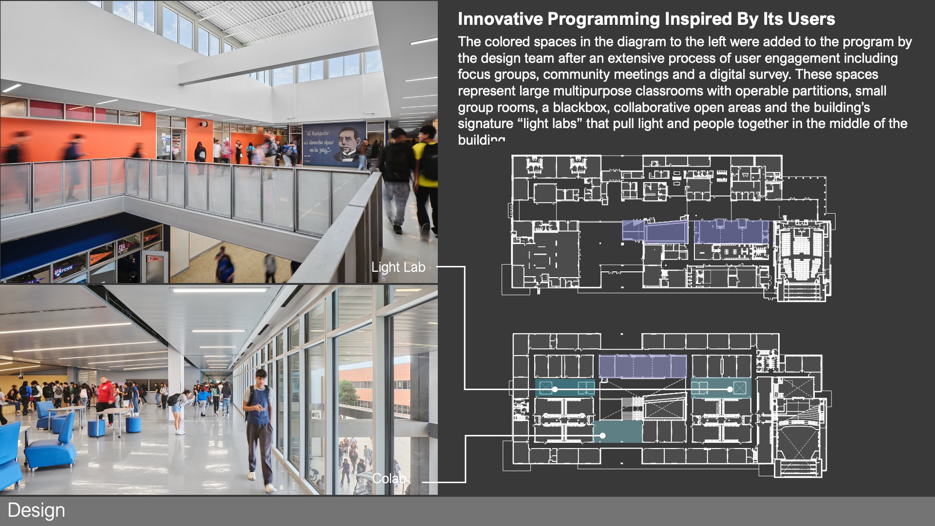
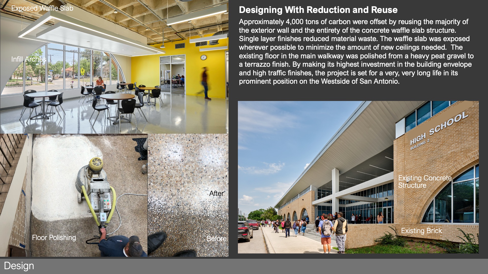
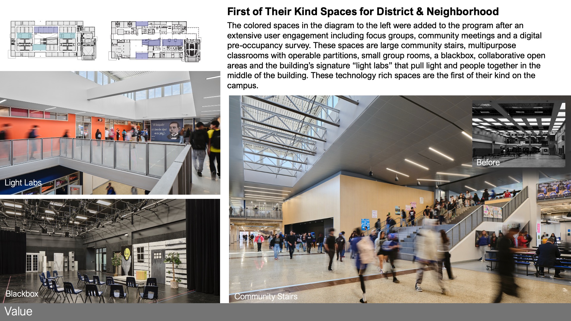
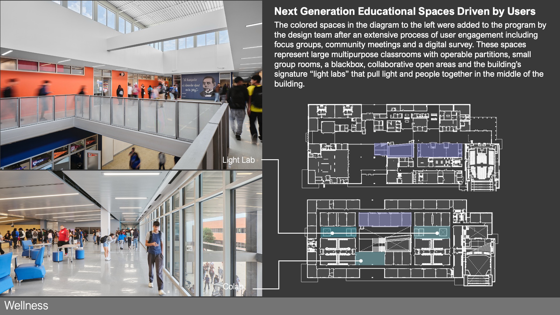
The design of this facility has “hard” and “soft” goals. For curriculum and teaching – the design team used a pre-occupancy survey to generate an enhanced program that offered extra-large 1100 sf classrooms with operable partitions, small group rooms, unscheduled collaborative mezzanines, extra wide hallways, large entry and exit porticos and the signature two –story “light labs”. From a physical point of view, the design celebrates the existing facility while giving a new daylit environment for its second (and third) life. The latter was particularly challenging as the building is very deep – 450’ x 230’. Important decisions included exposing the waffle slab, polishing the existing peat gravel floor in place, reinforcing the entire brick masonry façade and infilling the arches to make useful space out of an unobservable arcade.
 Value
Value
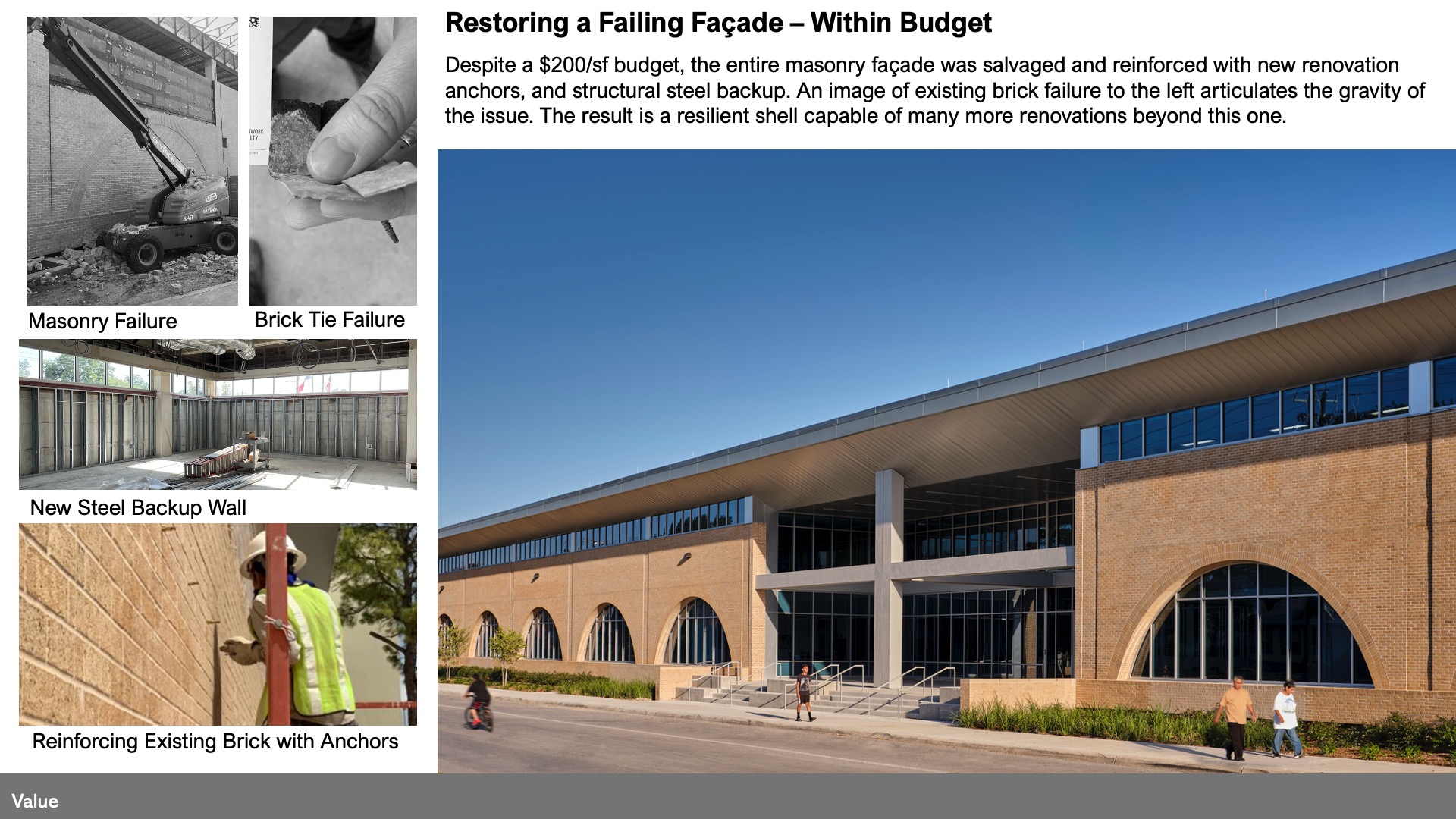
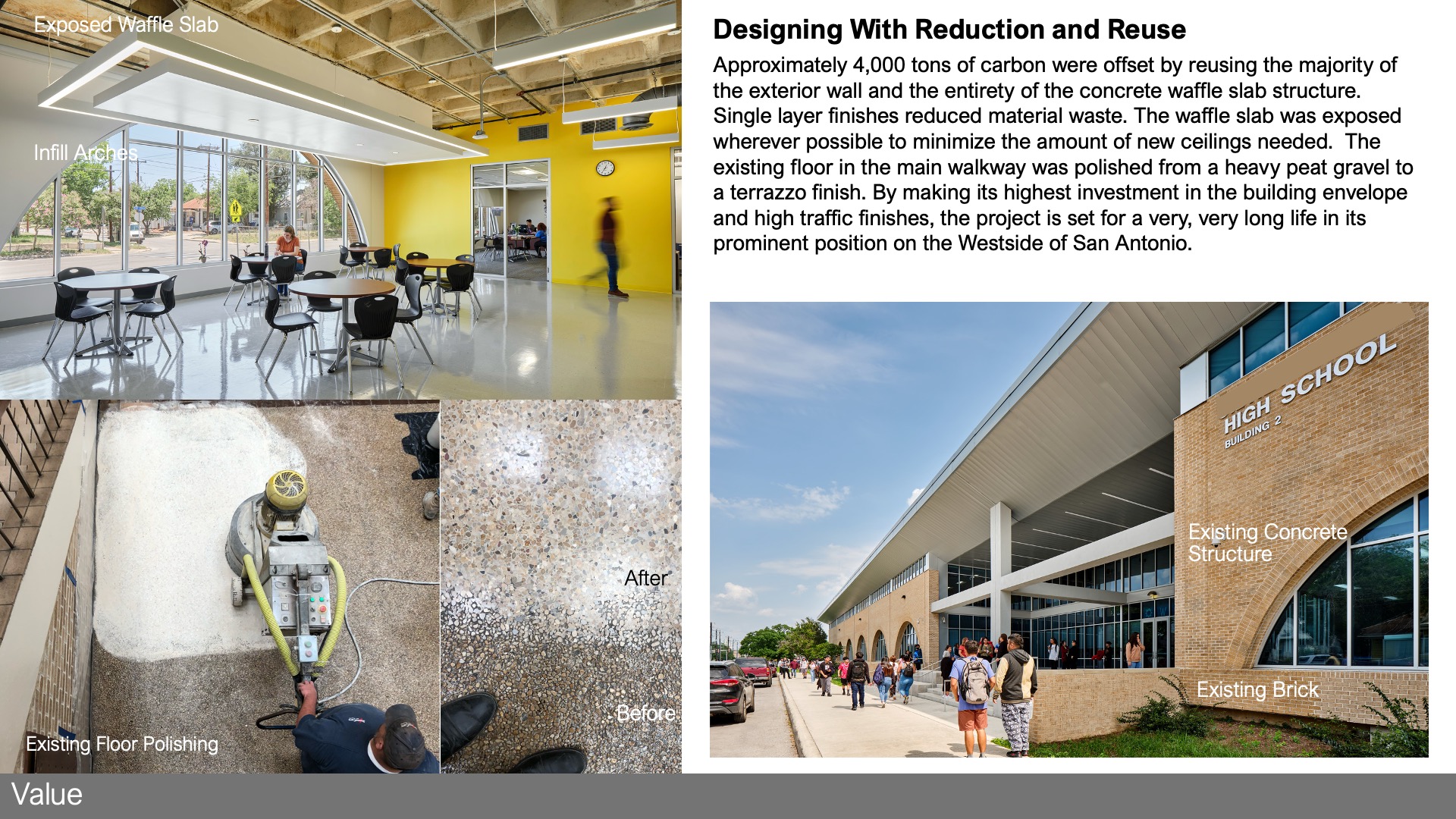
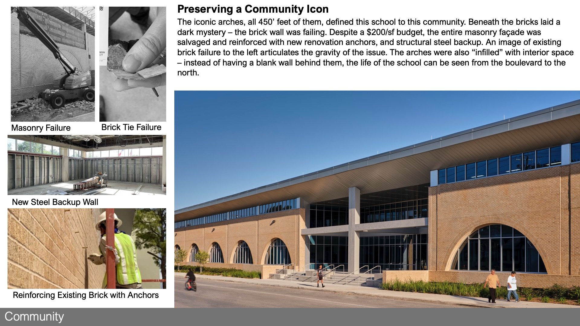
This project’s budget was very small – $200/sf. It was initially conceived as an interior renovation only. Abundance was reserved for spatial programming and proportions – classrooms with operable partitions, extra wide corridors and stairs, a proliferation of co-labs and the introduction of the “in between space” sprinkled throughout the project provide cost-neutral community spaces. The entire masonry façade was salvaged and reinforced with new renovation anchors and the entire roof deck was replaced with no change orders to contract value to create a resilient shell capable of many more renovations beyond this one. The approach was to get the big performing systems right first – the wall, roof and MEP systems. The design is very deliberate and humble about a reduced interior pallet – drywall, vinyl tile and acoustical ceiling tile being the predominant material choices. Re-use was very important – the exposed waffle slab serving as the ceiling and floor, the existing aggregate floor was polished in the main corridor and 75% of the exterior wall remained in place, although brought up to code with modern insulation and waterproofing.
 Wellness
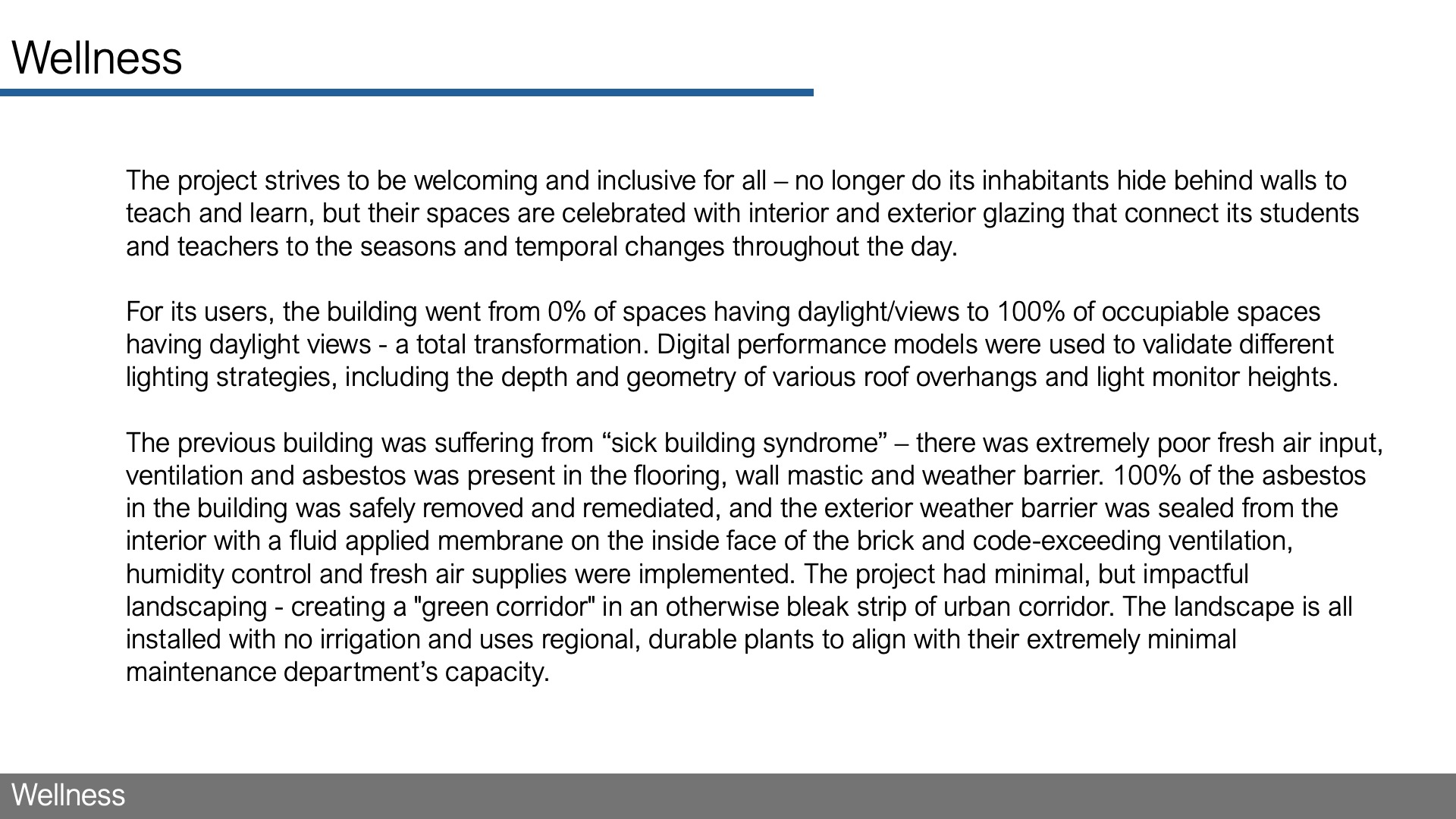
“The project strives to be welcoming and inclusive for all – no longer do its inhabitants hide behind walls to teach and learn, but their spaces are celebrated with interior and exterior glazing that connect its students and teachers to the seasons and temporal changes throughout the day.
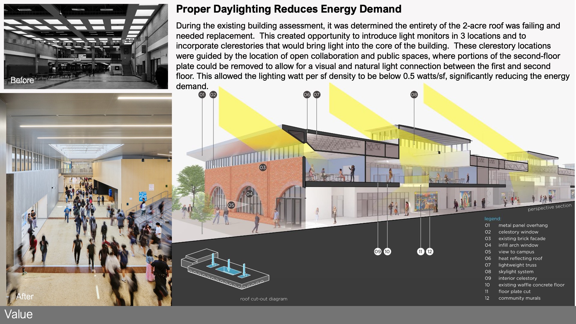
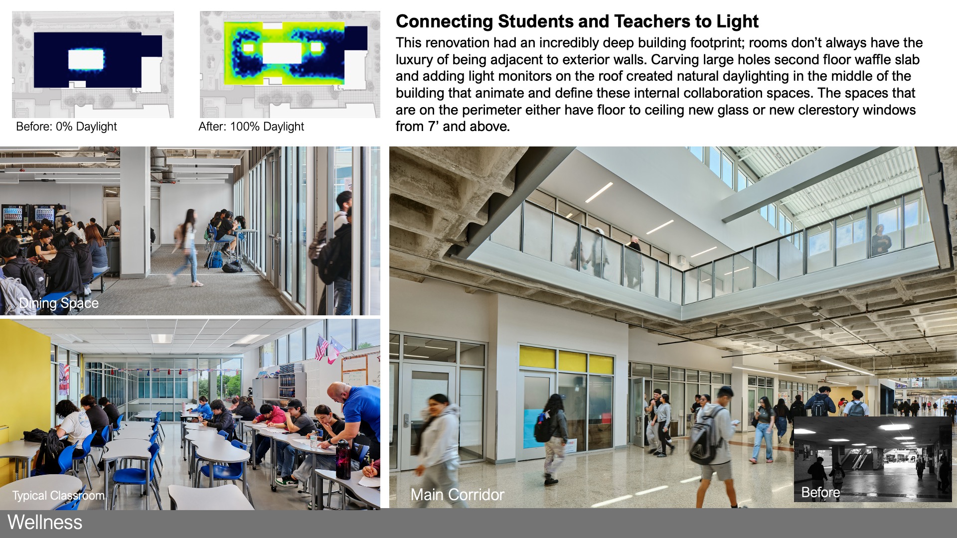
For its users, the building went from 0% of spaces having daylight/views to 100% of occupiable spaces having daylight views – a total transformation. Digital performance models were used to validate different lighting strategies, including the depth and geometry of various roof overhangs and light monitor heights.
The previous building was suffering from “sick building syndrome” – there was extremely poor fresh air input, ventilation and asbestos was present in the flooring, wall mastic and weather barrier. 100% of the asbestos in the building was safely removed and remediated, and the exterior weather barrier was sealed from the interior with a fluid applied membrane on the inside face of the brick and code-exceeding ventilation, humidity control and fresh air supplies were implemented. The project had minimal, but impactful Landscaping – creating a “”green corridor”” in an otherwise bleak strip of urban corridor. The landscape is all installed with no irrigation and uses regional, durable plants to align with their extremely minimal maintenance department’s capacity.”
 Community
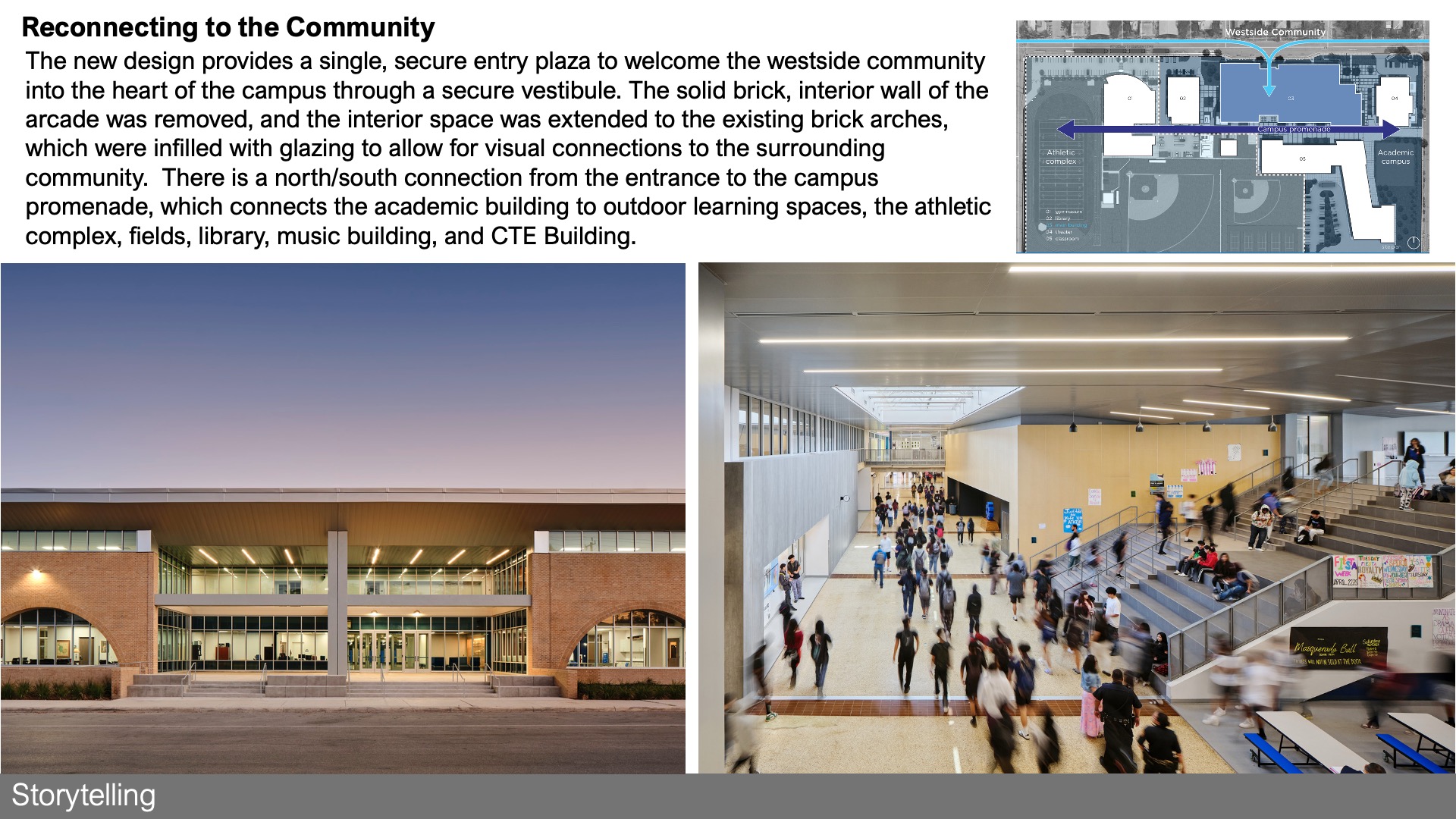
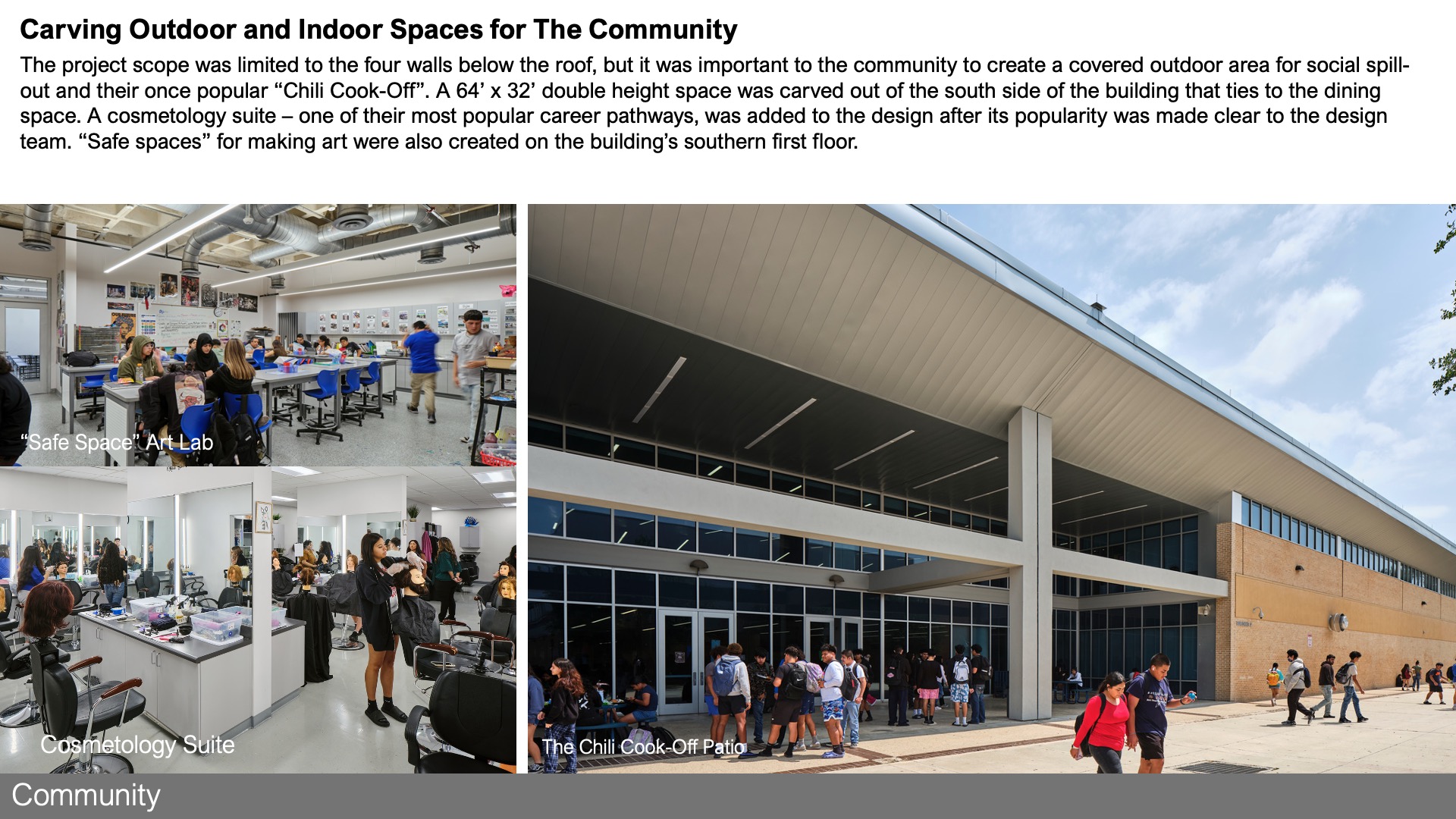
“This is an urban campus on a small property – students walk to school or take the bus. The project doubled-down on this unique situation by preserving the large building in lieu of a new smaller footprint building with a surface lot. The entry plaza creates an accessible, landscape-lined pickup and dropoff area with 1200 sf of outdoor covered area to serve as a community threshold. The building engages the community now by transforming it from a “wall building” to a transparent, accessible community resource.
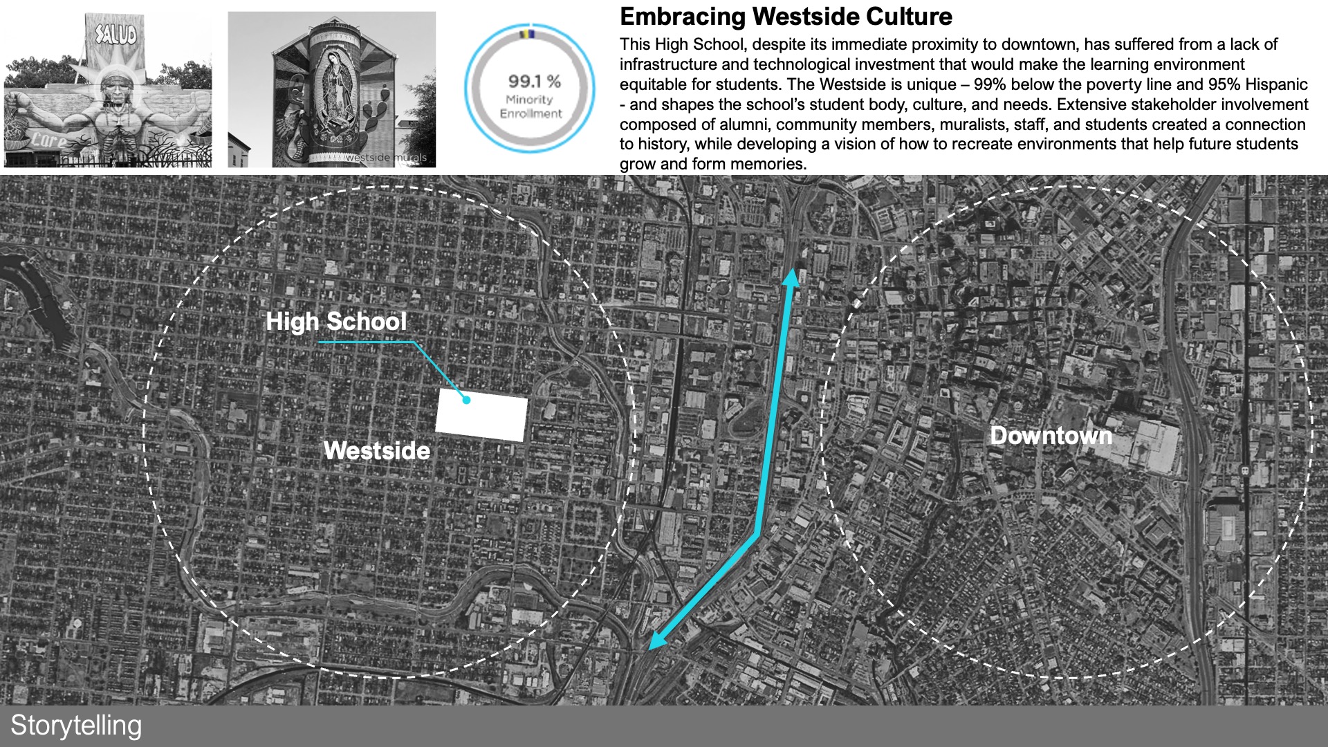
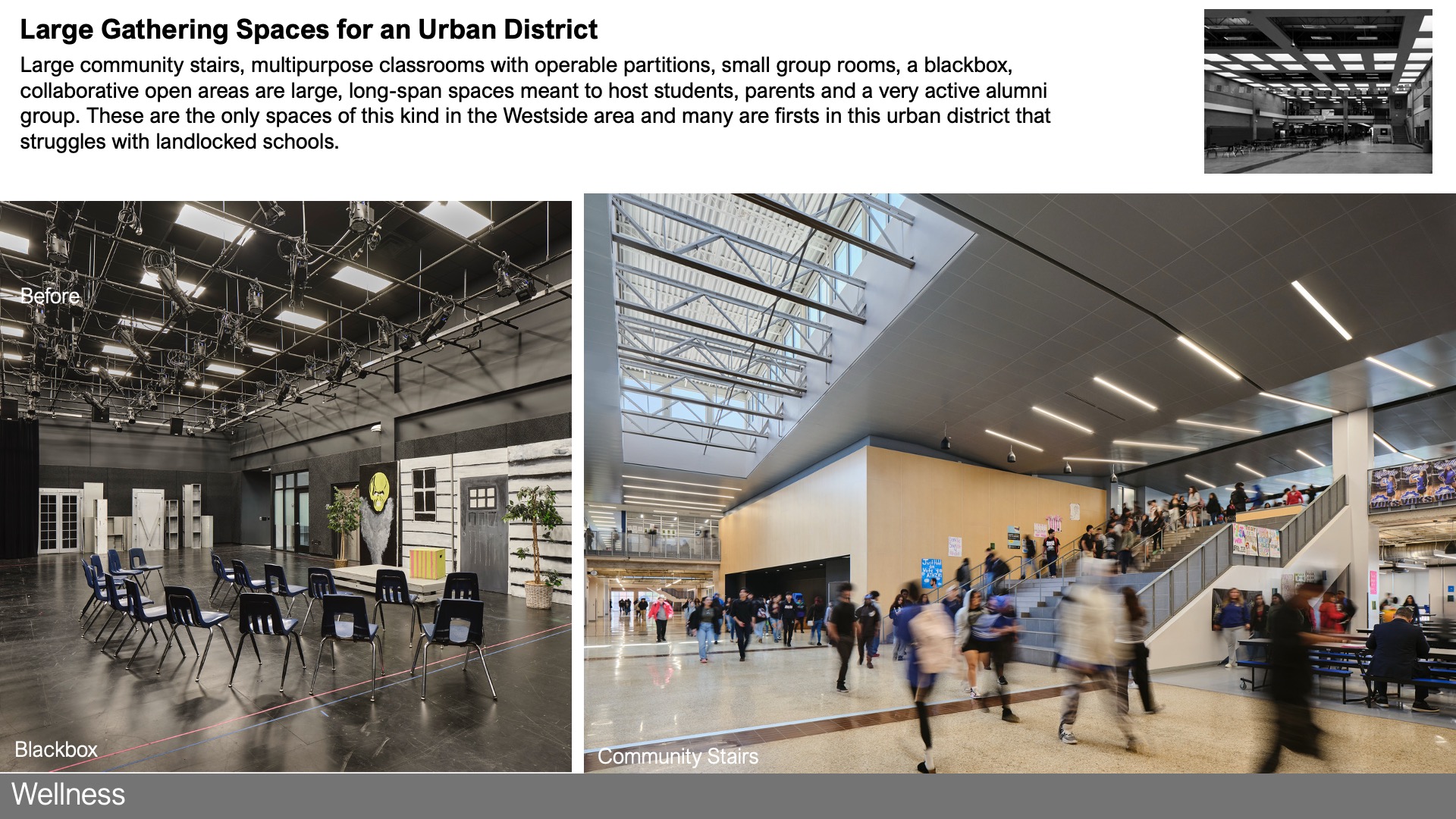
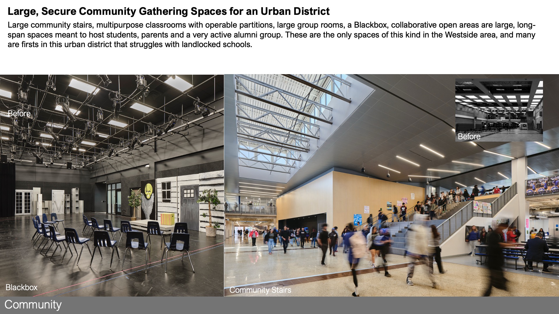
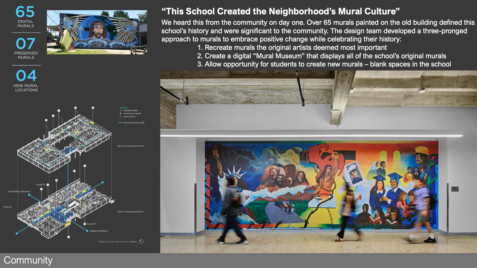
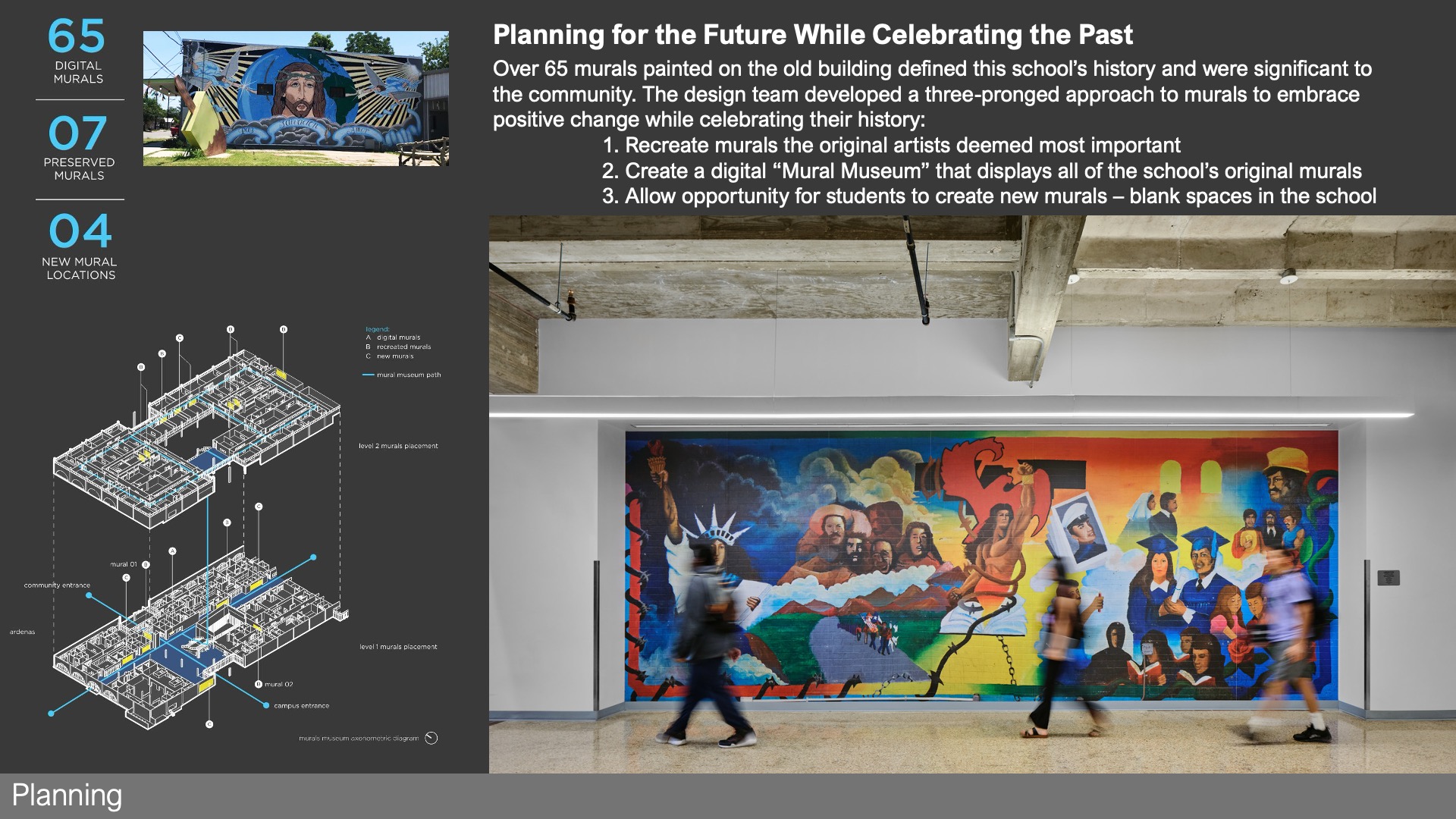
The Westside is a vulnerable community – 95% of its population is economically disadvantaged and 99% of its population is a minority. Few modern facilities exist in this neighborhood and a fear of gentrification pervades. By balancing the old and the new and offering very large indoor gathering spaces of many scales, the Westside has a new arena for civic engagement that is uniquely theirs. Of note – a “building funeral” was held for the existing facility to allow the community to grieve the previous building and allow them to say “goodbye” properly. A focus on their mural culture was key to the design.”
 Planning
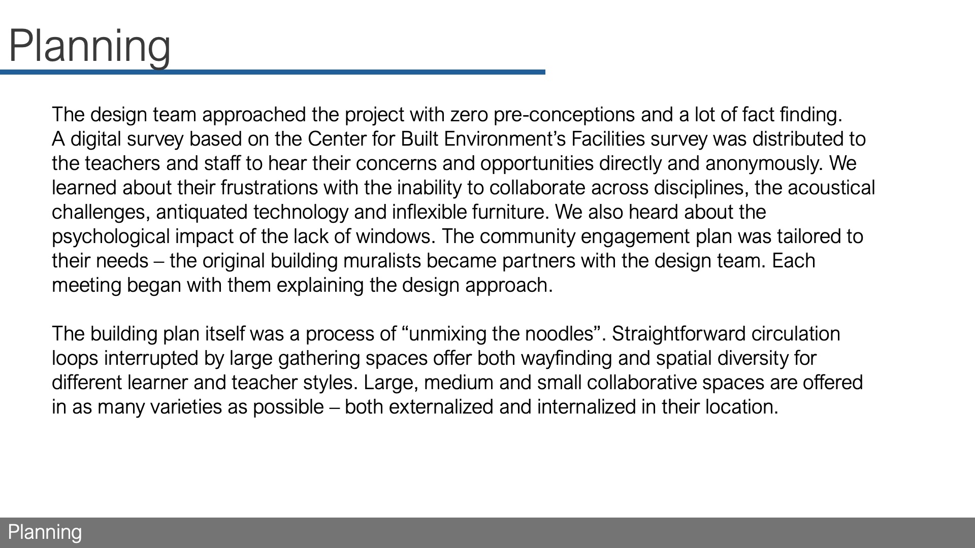
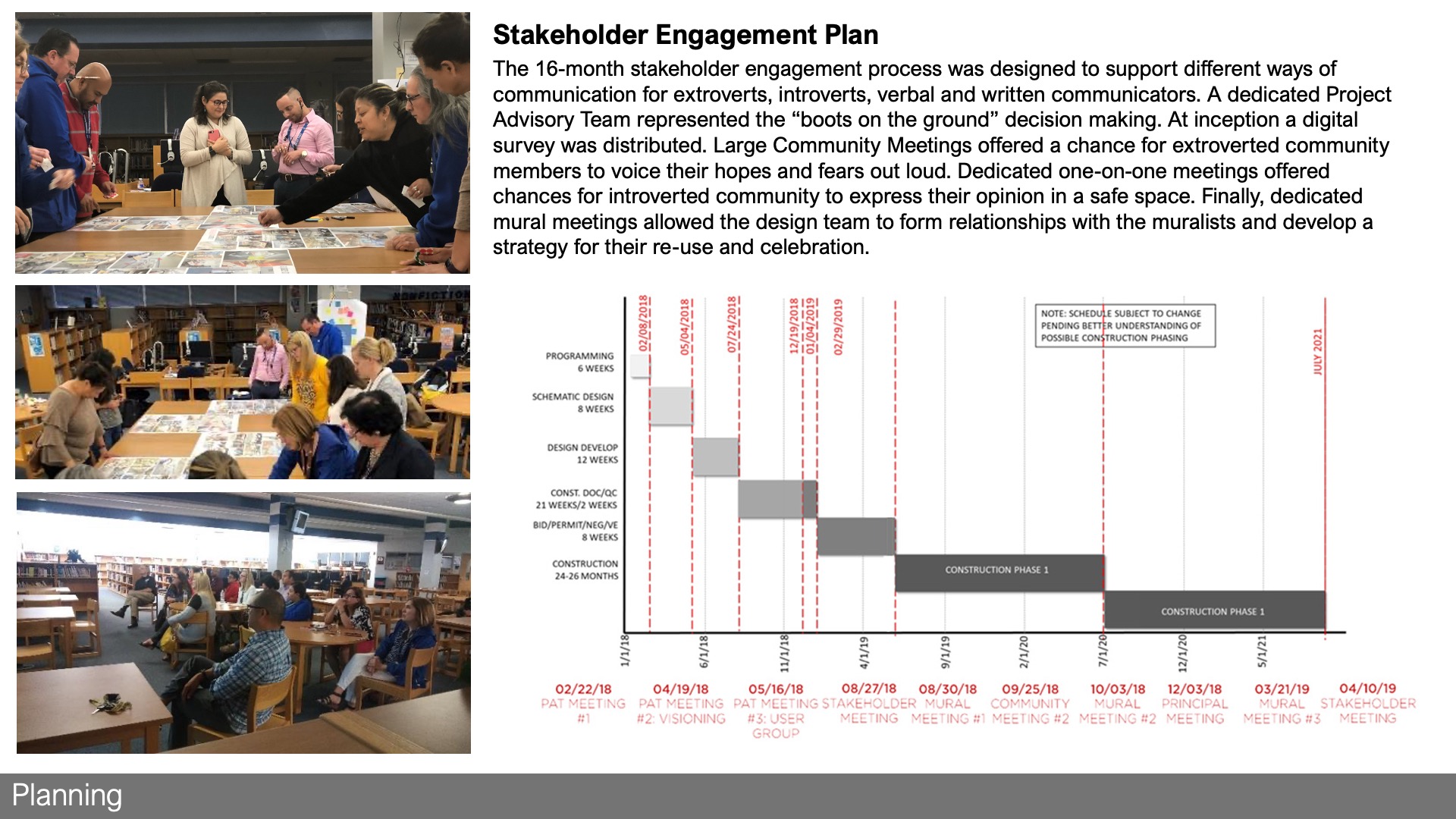
“The design team approached the project with zero pre-conceptions and a lot of fact finding.
A digital survey based on the Center for Built Environment’s Facilities survey was distributed to the teachers and staff to hear their concerns and opportunities directly and anonymously. We learned about their frustrations with the inability to collaborate across disciplines, the acoustical challenges, antiquated technology and inflexible Furniture . We also heard about the psychological impact of the lack of windows. The community engagement plan was tailored to their needs – the original building muralists became partners with the design team. Each meeting began with them explaining the design approach.
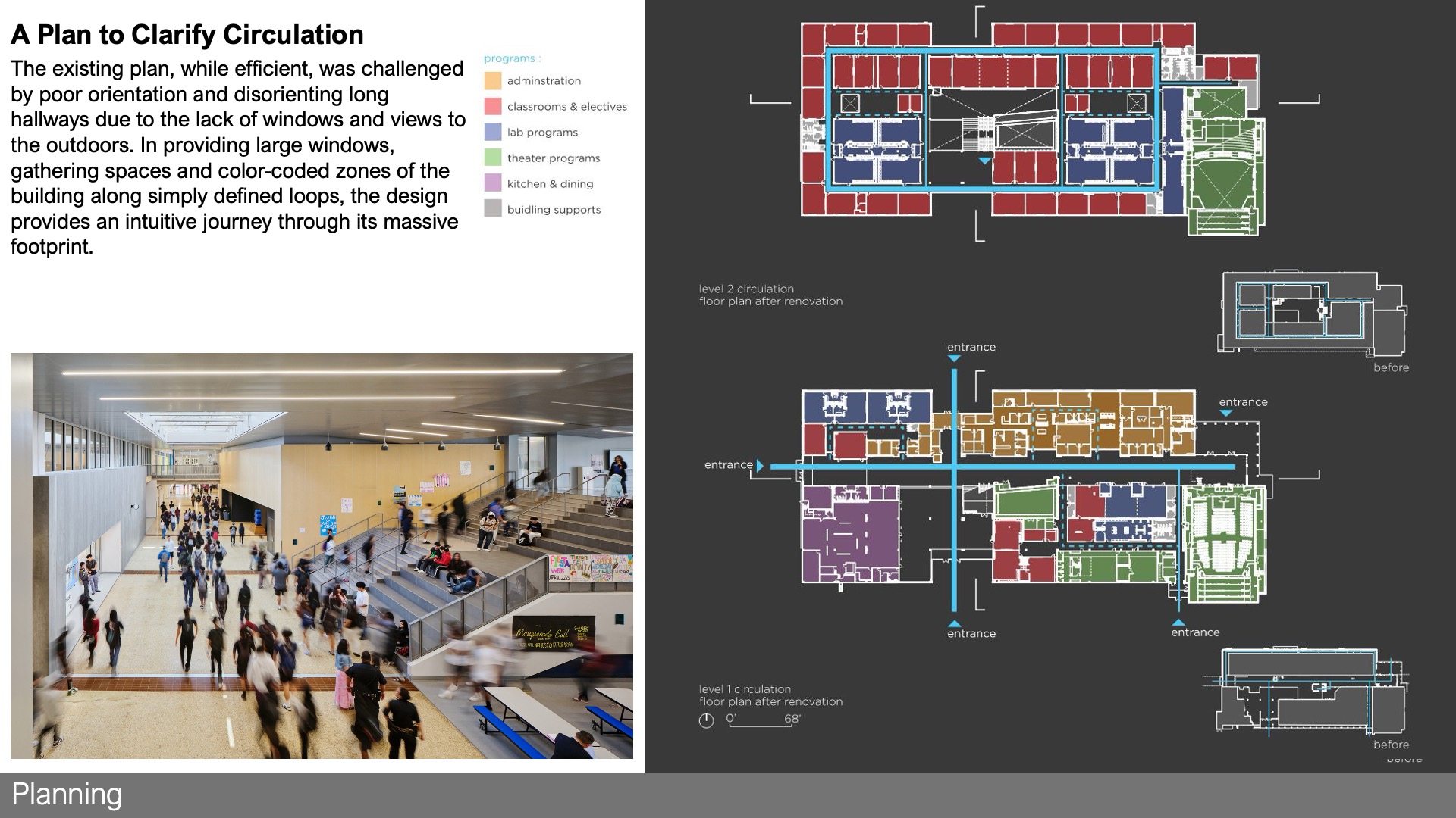
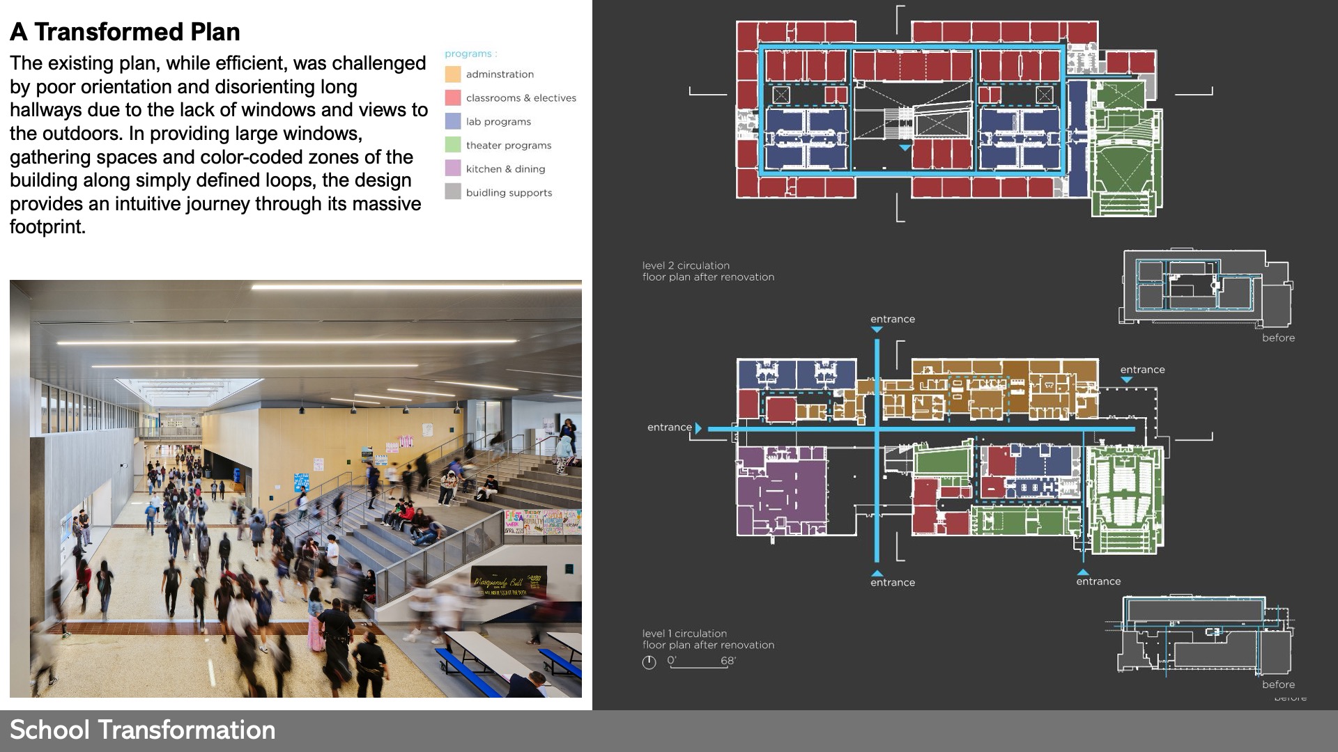
The building plan itself was a process of “unmixing the noodles”. Straightforward circulation loops interrupted by large gathering spaces offer both wayfinding and spatial diversity for different learner and teacher styles. Large, medium and small collaborative spaces are offered in as many varieties as possible – both externalized and internalized in their location.”
 School Transformation
This project elevates and celebrates a spirited community stuck in a facility antithetical to community engagement, educational innovation and high-performance design. The project set lofty goals around daylight, culture, performance and curriculum advancement to give the building and academics a richer “second life”. Design goals were to have 100% of teaching spaces have access to natural daylight or views, reduce energy consumption by 60% from baseline, offer next-generation flexible learning spaces and celebrate their history and culture all while offering continuity for this generational school. A major hurdle was the building had no “front door” but many “back doors” – each unable to be secured or monitored. The project addresses wayfinding and security by creating a new “campus gateway”. Many technical reinforcements invisible in the project photography support a “second life” for the building. The entirety of the existing masonry façade was reinforced, the failing roof deck, insulation and waterproofing were replaced in their entirety. Deep overhangs were added to the roof perimeter to minimize the amount of water that ever falls on the façade, and shade the continuous clerestory. The best parts of the building were preserved to embed the school in a permanent way to this neighborhood. The community has called this a “Wizard of Oz Transformation” – like going from black and white to color.
![]() Star of Distinction Category Winner
Star of Distinction Category Winner

