Fort Worth ISD—O.D. Wyatt High School
Architects: HarrisonKornberg Architects
“Originally constructed in the 1960s, the renovation of OD Wyatt was long overdue. As part of the 2017 FWISD Bond Program, this renovation benefits one of the oldest portions of the existing high school. The scope of the renovation includes: restroom refurbishments, new collaboration areas, a modernized media center, renovation to fine arts spaces, and science classroom upgrades. In addition to building renovations, project scope included: finish and lighting upgrades to the corridors, new mechanical and fire sprinkler systems, a secured entry vestibule addition, and an added drop-off bus lane.
An all new, two-story CTE addition includes: business/marketing classrooms, engineering/STEM classrooms and robotics maker space, arts/AV classrooms, health science labs/pharmacy, education training classrooms, and collaboration/flex space.
The school’s campus was kept open throughout construction. The project was phased and executed in such a way that disruption to the school population was minimal.”
Design
OD Wyatt was a dark maze of non-descript classrooms. Freshman and sophomores complained about changing classes because the building was difficult to navigate. Due to the building’s geometry, we were regulated to using long corridors. Therefore, our design goal focused on creating clusters and interstitial spaces along these corridors to define academic pods. Through the use of academic pods which were clustered by grade and subject, this made the building very efficient, easy to navigate, and collaborate by academic discipline.
Value
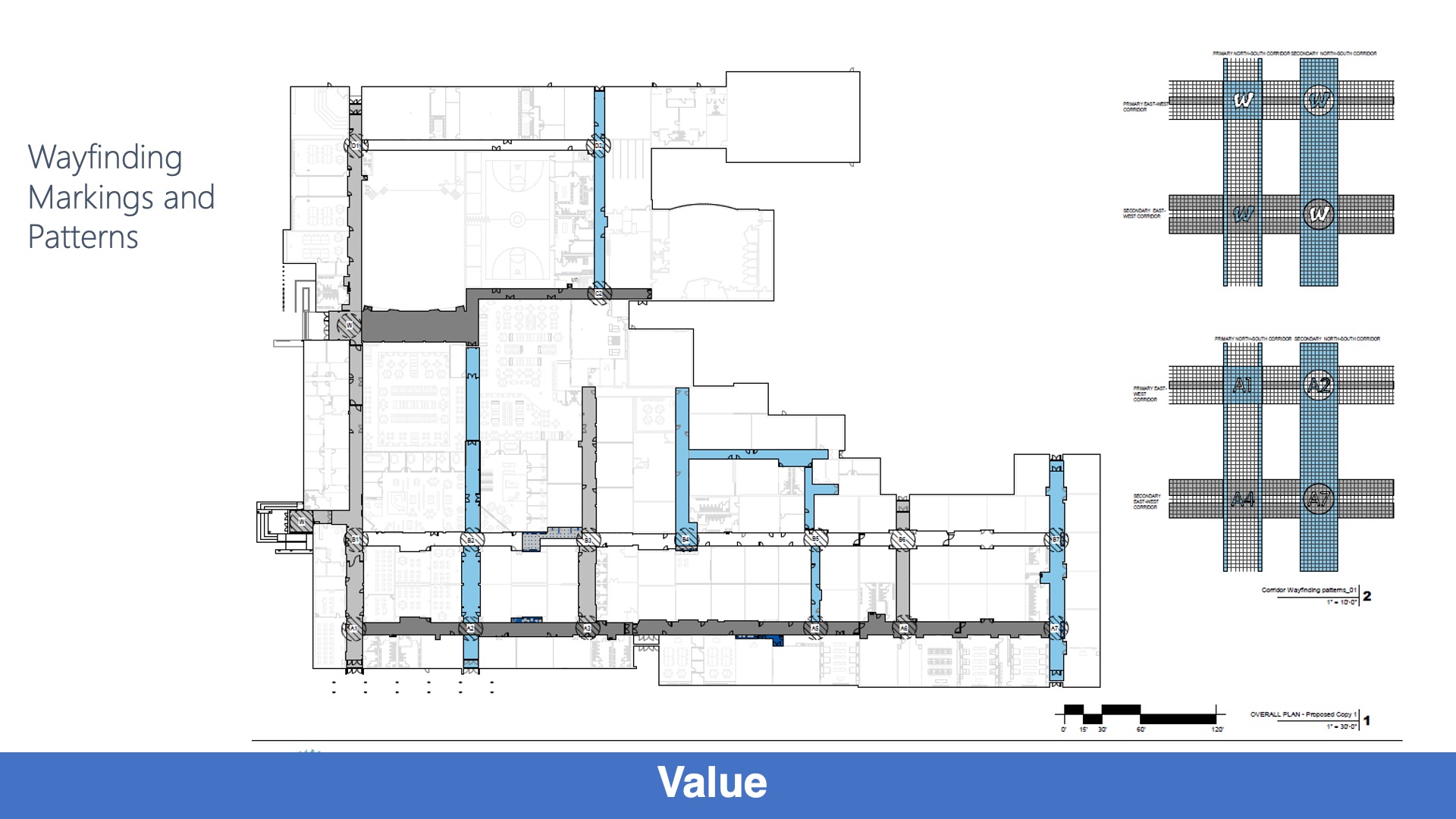
Through the creation of clusters and academic pods, the renovated layout improved efficiency by assisted students navigate the building. Materials including laminate wall covering employed in heavy traffic areas were durable, easy to clean, and low maintenance. The availability of laminate in a variety of colors was a part of our design goal to improve wayfinding.
Wellness
As a part of our initiative to design sustainably, interior glazing was incorporated to allow for shared daylight from classrooms on the exterior wall to classrooms in the central core. Where artificial light was employed new LED lighting was incorporated along with energy efficient HVAC units to conserve energy.
Community
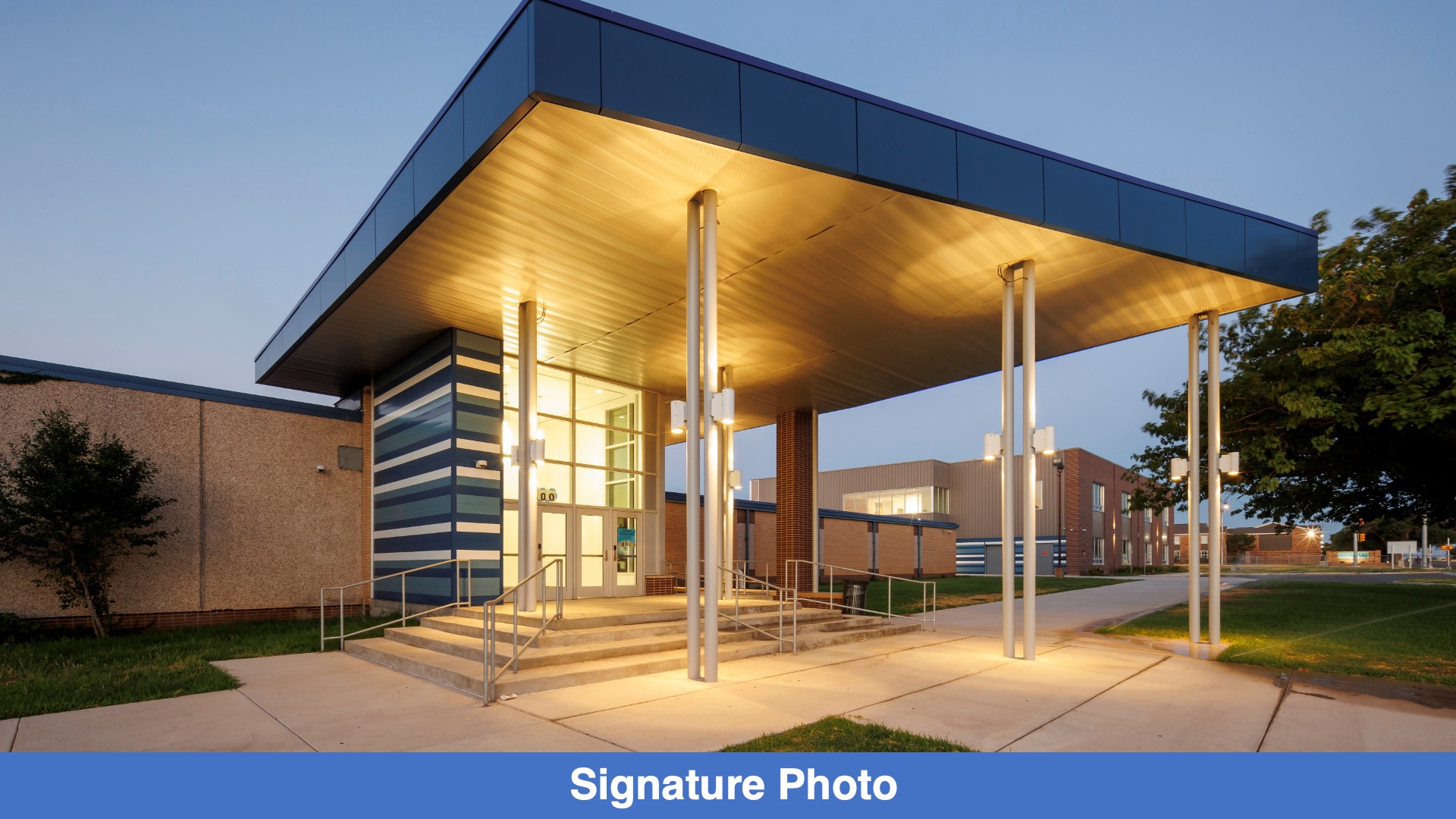
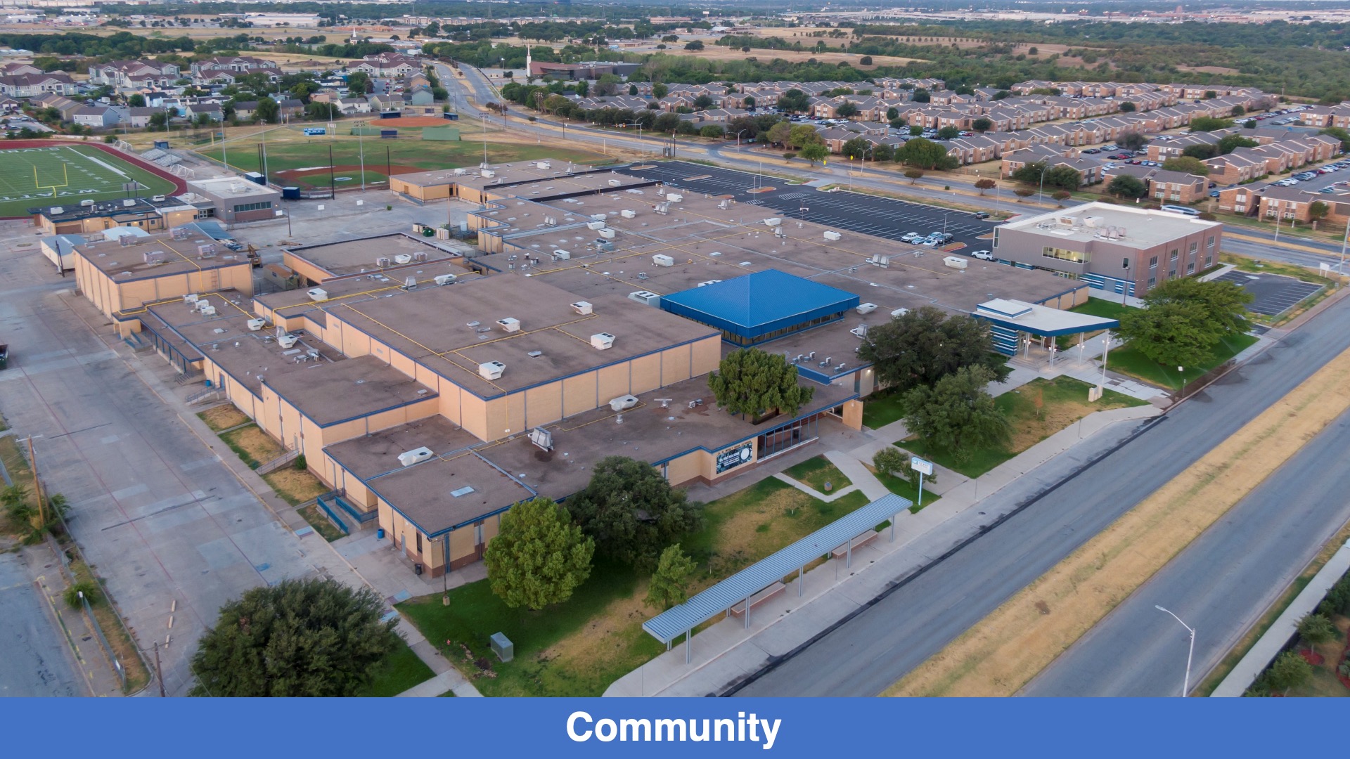
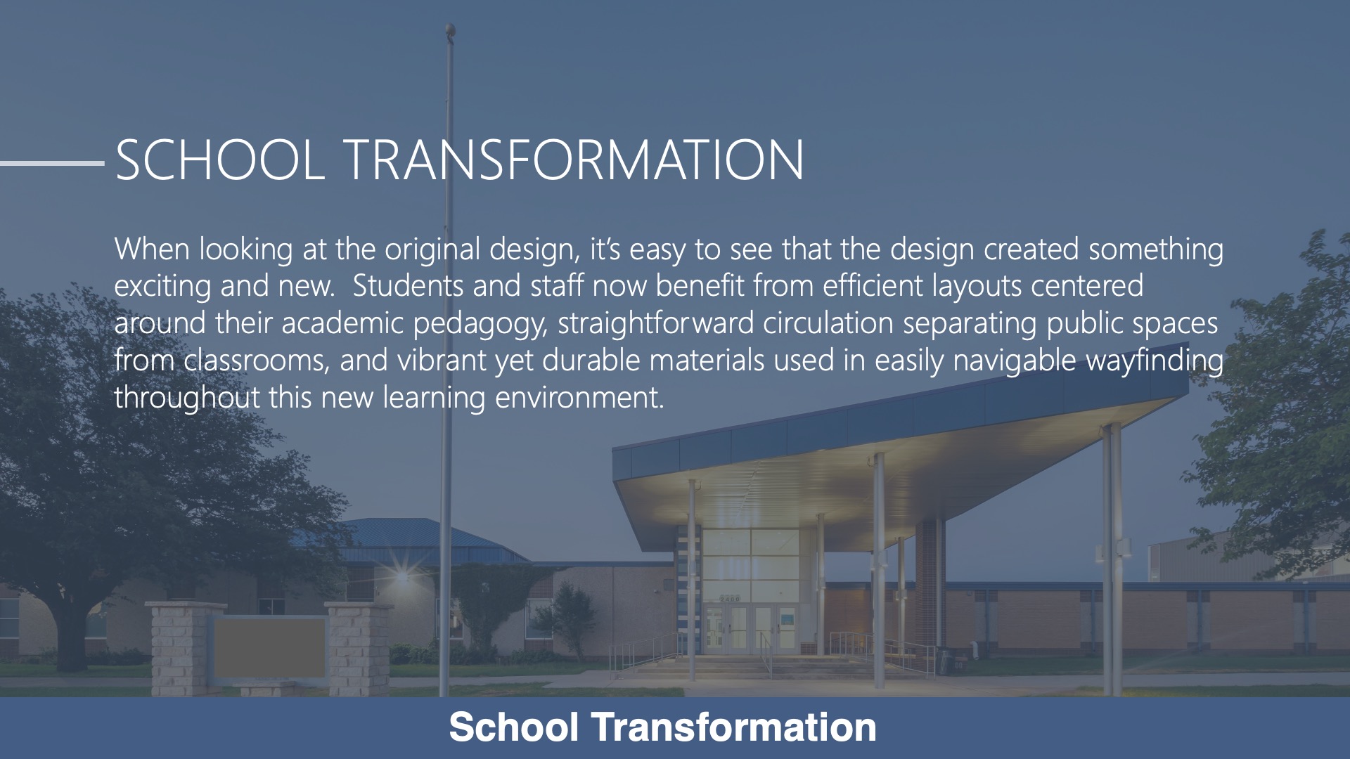
As a part of the renovations, we created an iconic visitor entrance that served as a beacon to the neighborhood. This entry with a secure vestibule has an iconic form while incorporating the school colors into the design. Visitor parking was adjacent to the new entry. And, visitors were welcomed to the building with direct views of the media center where they could see students collaborating. To relieve congestion at the visitor entrance, we segregated the bus drop off by providing a separate access lane. The entry for bus drop off was directly adjacent to the school’s assembly areas to accommodate large groups of students arriving.
Planning
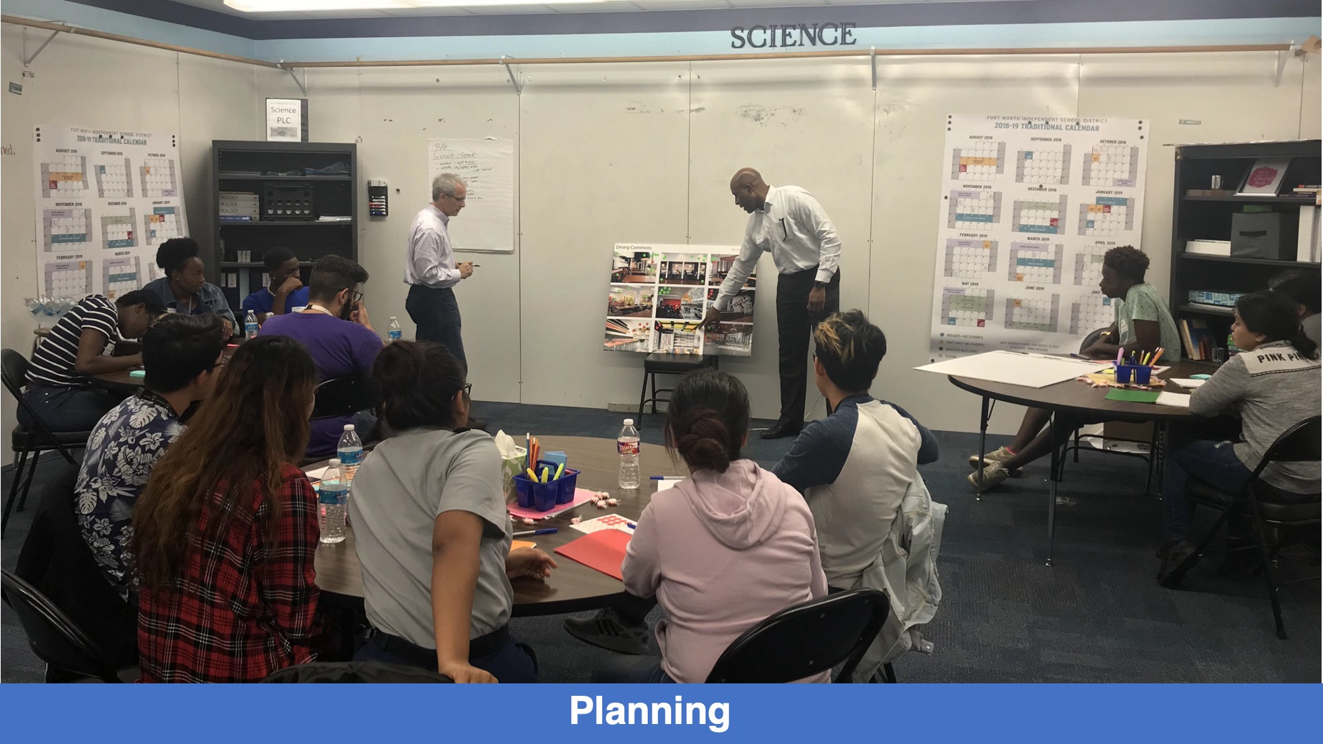
Thorough meetings with the teachers where we learned about their pedagogy, we clustered the classrooms into academic learning pods. Through meetings with the students where we heard about the inefficiencies of the layout, we created a more straight forward and efficient design. These series of meetings with both faculty and students not only achieved their educational goals but a design that is not only functional but aesthetically pleasing.
School Transformation
When looking at the original design, it’s easy to see we created something exciting and new. Efficient layouts centered around their academic pedagogy, straightforward circulation separating public spaces from classrooms, and vibrant yet durable materials which are a part of the wayfinding all come together to create this new learning environment.
![]() Star of Distinction Category Winner
Star of Distinction Category Winner

